Are they worth the extra dollar? I'm not sure yet. I've only swatched them on my nail tip sticks, and so far I like the quality (some more than others). But during my swatching ritual, I noticed something. I was suspicious that I had seen some of the colors before. I took out my other Sinful swatches, and well- you decide.


Most Sinful #1242 & Endless Blue #1052
These were the first colors I swatched. I really can't tell the difference between these two. It's a good thing I LOVE this color. The Sinful Shine display boasts that the Sinful Shine line has "new gel technology" that makes the new polishes shiny. I don't see a difference in the shine between these two either. Maybe I will when I apply to my actual nails.


Devious #1230 and Ruby Ruby #369
This is another one. I can't tell the difference- and it's a good thing I LOVE both of these as well. They are both jelly-like, great color, and apply well.


All the Rage #1217 and Folly #395
These two are very similar, Folly is just a little bit darker, but they are the same tone.


At Sea #1245 and Sweet Nothing #1171
Another very close match. Sweet Nothing is a bit darker, but not by much.


Bananappeal #1218 and Pull Over #955
These two are pretty close too. Pull Over is a little darker, and Bananappeal is more opaque, but they are very close.


Bottoms Up #1243 and Rain Storm #1053
I have a hard time telling these two apart. Very close in color and coverage.


Come Hither #1221 and Dressed to Kill #1125
Come Hither is a bit more orange, but not by much.


In the Limelight #1233 and Exotic Green #1105
Really close again. Limelight is a bit lighter, but not by much.


Mardi Gras #1236 and Hazard #952
These two are really close- I have a hard time seeing the difference.
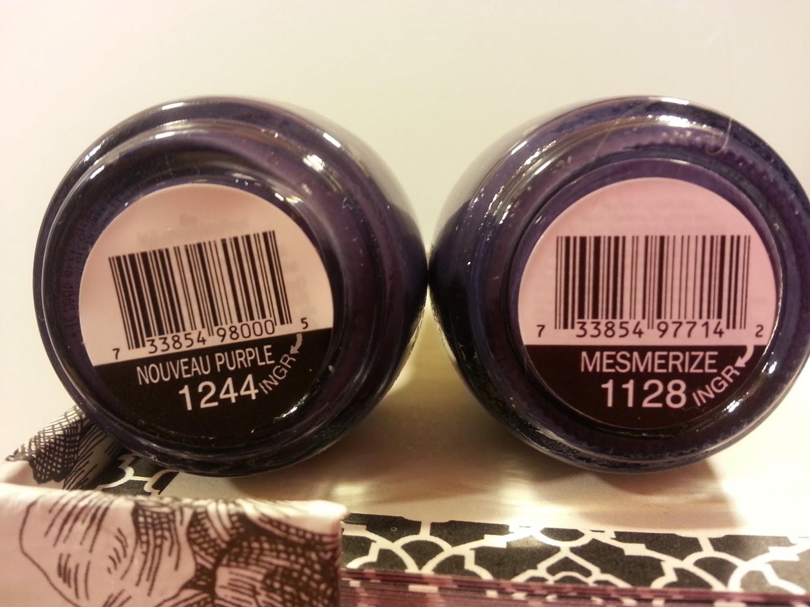

Nouveau Purple #1244 and Mesmerize #1128
This is another pair in which I can't tell one from the other. Identical in color, coverage and shine.


Rebel #1234 and Nirvana #949
Very close. No difference in shine, but Nirvana is just very slightly lighter.


Royal Flush #1246 and Outrages #1124
These two actually look closer in color than the picture shows. They are both very shiny, both opaque, almost one-coaters.
I have more pictures of swatches that I will post later. So far, I think that if you have some of the colors that are close to the Sinful Shine line, it might not be worth the extra dollar. I might change my mind after I actually wear the colors on my nails, but I'll let you know when I do and what I think.
Happy Polishing!
No comments:
Post a Comment